library(tidyverse)
library(lubridate)
library(metR)
library(trend)
library(pals) # color palettesComputing trends in a climate grid with Tidyverse
R
Tidyverse
Climate
Trends
NetCDF
A step-by-step tutorial on reading NetCDF climate data with the
metR package in R and computing Mann-Kendall trend tests and Sen’s slope on a spatial grid.
Reading a NetCDF in the Tidyverse style
It is possible to read a NetCDF file in a Tidyverse way through the metR package created by Elio Campitelli. This library also contains many useful functions for visualizing and analyzing weather and climate data.
In this tutorial, we will work with a daily grid of 5×5 km of the maximum temperature of the Balearic Islands (Spain) from the STEAD dataset (Serrano-Notivoli 2019).
We use GlanceNetCDF() to inspect the file and ReadNetCDF() to read it into a data.frame:
file <- "tmax_bal.nc"

# Inspect the NetCDF structure
variable <- GlanceNetCDF(file = file)
variable

# Read the NetCDF as a data.frame
tx <- ReadNetCDF(
  file = file,
  vars = c(var = names(variable$vars[1])),
  out = "data.frame"
)
Data management: annual aggregation
After filtering NA values, we aggregate daily data to annual means per grid cell:
tx <- tx %>%
  filter(!is.na(var)) %>%
  as_tibble()

tx_annual <- tx %>%
  mutate(Time = as_date(Time)) %>%
  mutate(year = year(Time)) %>%
  group_by(year, lon, lat) %>%
  summarise(annual_tx = mean(var)) %>%
  ungroup()
Trend computation and statistical significance
We apply the Sen’s slope (magnitude of trend per decade) and the Mann-Kendall test (statistical significance) at each grid cell:
tx_trend <- tx_annual %>%
  group_by(lon, lat) %>%
  summarise(
    slope = sens.slope(annual_tx)$estimates * 10,  # per decade
    sign  = mk.test(annual_tx)$p.value
  )
Visualization
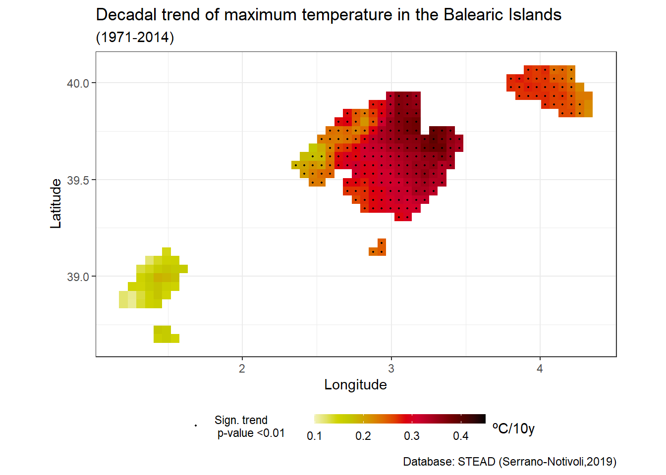
ggplot() +
  geom_tile(data = tx_trend, aes(x = lon, y = lat, fill = slope)) +
  scale_fill_gradientn(
    colors = rev(pals::linearlhot(100)),
    name = "ºC/10y",
    limits = c(0.1, 0.45)
  ) +
  geom_point(
    data = filter(tx_trend, sign < 0.01),
    aes(x = lon, y = lat, color = "Sig. trend (p < 0.01)"),
    size = 0.4, show.legend = TRUE
  ) +
  scale_color_manual(values = c("black"), name = "") +
  coord_fixed(1.3) +
  xlab("Longitude") + ylab("Latitude") +
  labs(
    title = "Decadal trend of maximum temperature in the Balearic Islands",
    subtitle = "(1971–2014)",
    caption = "Database: STEAD (Serrano-Notivoli, 2019)"
  ) +
  theme_bw() +
  guides(fill = guide_colourbar(barwidth = 9, barheight = 0.5, title.position = "right")) +
  theme(legend.position = "bottom")
The result of running the code above looks like this:
If you have any questions, feel free to leave a comment or reach out!